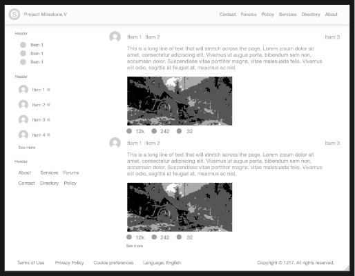
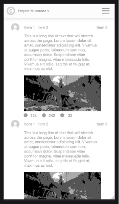
A screen shot of the final design is below and you can view it here if running in the browser
Note: We are using the Outline option to show a red outline to show the boundaries of the groups
Responsive Parts - Main Content
Set artboard page to 100% width and 100% height and vertical scroll bars if needed
Let’s create the first main content area
Create a few items
Group the items
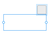
Move the items to size the group (or use Alignment plugin fill feature) and set anchor left and right. Setting to left and right removes the width style
For automatic symmetrical layout of items set group layout to row or rowreverse
Or for specific positioning of items set group to horizontal Stack and element property to Stack
Note: If the group is not set to Stack in Adobe XD a warning icon will be displayed next to the layout icon
To fix this in the Adobe XD property panel click the Stack checkbox
To make a stack dynamic and push one group item away from another group item select the item and set item alignment push right
Add a different sized icon. You may need to resize the group. Move the gaps or unstack it and use Alignment plugin. The panel lists item position
If items in a group aren’t all the same height you might want to center them manually. Select all the smaller items and vertically align them
If you want the items to automatically be vertically centered then select the group and set the Align Items to centered
You may need to remove the sizing on the text items. Select the text fields and set the sizing to no sizing or width
If the items are out of order in the Stack open the layers panel and rearrange the order
Item 1
Item 2
Item 3
Item 1
Item 2
Item 3
Item 1
Item 2
Item 3
Item 3
Item 2
Item 1
Item 3
Item 2
Item 1
Item 3
Item 2
Item 1
Item 3
Item 2
Item 1
Item 3
Item 2
Item 1
Item 3
Item 2
Item 1
Item 3
Item 2
Item 1
T
If you move or resize the group you may need to turn off stack, move things around and then re enable the stack
Note: When you enable a Stack some items may be grouped together resulting in undesired export results. You will need to restore the original arrangement
You can also adjust the group items using the Stack spacing before or spacing after values
Responsive Parts II - Main Content II
Lets add another row. Create a fixed size text field
Group the two rows and set the group to vertical Stack and the layout to Stack
Set the group width to no sizing and anchor left and right
To allow the textifeld to grow select it and set it to no sizing
If we want the text field to be positioned away from the edge of the group, move it to where you want, set the left and right anchors and set the position by to margin. Preview in a browser and resize the browser
Lets add an image and a group of statistic icons. Create both and then using the layers panel place them under the text field adjust the spacing. The stats are a horizontal stack with center alignment and no sizing.
Item 3
Item 2
Item 1
This is a long line of text that will stretch across the page. Lorem ipsum dolor sit amet, consectetur adipiscing elit. Vivamus ut augue porta, bibendum sem non, accumsan dolor. Suspendisse vitae porttitor magna, vitae malesuada felis. Vivamus elit odio, sagittis at feugiat at, maximus ac nisl.
This is a long line of text that will stretch across the page. Lorem ipsum dolor sit amet, consectetur adipiscing elit. Vivamus ut augue porta, bibendum sem non, accumsan dolor. Suspendisse vitae porttitor magna, vitae malesuada felis. Vivamus elit odio, sagittis at feugiat at, maximus ac nisl.
Item 3
Item 2
Item 1
This is a long line of text that will stretch across the page. Lorem ipsum dolor sit amet, consectetur adipiscing elit. Vivamus ut augue porta, bibendum sem non, accumsan dolor. Suspendisse vitae porttitor magna, vitae malesuada felis. Vivamus elit odio, sagittis at feugiat at, maximus ac nisl.
Item 3
Item 2
Item 1
32
242
12k
This is a long line of text that will stretch across the page. Lorem ipsum dolor sit amet, consectetur adipiscing elit. Vivamus ut augue porta, bibendum sem non, accumsan dolor. Suspendisse vitae porttitor magna, vitae malesuada felis. Vivamus elit odio, sagittis at feugiat at, maximus ac nisl.
Item 3
Item 2
Item 1
Responsive Parts III - Main Content III
Let’s repeat the group to show how the content can be repeated. Duplicate the group and then select both groups and group them
Make the group a Vertical Stack and set the left and right. Also set to no sizing to allow it to grow vertically
32
242
12k
This is a long line of text that will stretch across the page. Lorem ipsum dolor sit amet, consectetur adipiscing elit. Vivamus ut augue porta, bibendum sem non, accumsan dolor. Suspendisse vitae porttitor magna, vitae malesuada felis. Vivamus elit odio, sagittis at feugiat at, maximus ac nisl.
Item 3
Item 2
Item 1
Responsive Parts IV - Left Column
Let’s eventually make the page into two columns. First make the left column
Create a text field for the header and then three rows underneath it
The header will stretch so we will set it to no sizing
Add a second header that will also be set to no sizing
Add a second group of items for dynamic content in a vertical stack. It will have no layout and no sizing (not applied yet)
Add a more text button at the bottom of the group
Add a third header for a group of links
Set this group to row, set items to wrap and add a stylesheet template to add margins to each group item. There is a macro showing a stylesheet template example. Set it to no layout and no sizing once it’s inside the left column main group.
For the group items if and when the row wraps we need to add space between them. We can do two things. Set the group items to no sizing (if using margin style rule on the group)
OR change the text to a Fixed Size Textfield and set a height on each item.
NOTE: If you notice the row items appear out of order. That is because on the artboard we are laying them out visually but when we export we are exporting as a flex box row of items.
As soon as we use a row layout the items are positioned in the order they are declared not how you arrange them on the artboard.
To change the order open the layers panel and arrange them in the position that you desire.
Add 3 rows each a horizontal stack with the items vertically aligned. No layout and no sizing
Group all the items above and make the group into a Stack and add a right side padding of 20. Resize the stack group to 280 pixels wide.
Let’s also add a spacer element to the bottom of the group. We could use padding but sometimes a spacer is all that’s needed.
Duplicate a text field and make it have one space in it. Place it at the end of the group.
You can choose to export it or not but it’s presence will cause a margin to be added to the previous item.
Let’s make the page into two columns. First add two text fields for prototyping
Group the text fields and set the group to Stack and no sizing. Set the left and right anchors.
Resize the left column text field to 280 px. Set the right text field to no sizing.
To prevent the left column text field from shrinking set the flex-shrink to 0 in the styles fieldsizing.
Left column content
Right column content. This is a long line of text that will stretch across the page. Lorem ipsum dolor sit amet, consectetur adipiscing elit. Vivamus ut augue porta, bibendum sem non, accumsan dolor. Suspendisse vitae porttitor magna, vitae malesuada felis. Vivamus elit odio, sagittis at feugiat at, maximus ac nisl.
Right column content. This is a long line of text that will stretch across the page. Lorem ipsum dolor sit amet, consectetur adipiscing elit. Vivamus ut augue porta, bibendum sem non, accumsan dolor. Suspendisse vitae porttitor magna, vitae malesuada felis. Vivamus elit odio, sagittis at feugiat at, maximus ac nisl.
Left column content
Right column content. This is a long line of text that will stretch across the page. Lorem ipsum dolor sit amet, consectetur adipiscing elit. Vivamus ut augue porta, bibendum sem non, accumsan dolor. Suspendisse vitae porttitor magna, vitae malesuada felis. Vivamus elit odio, sagittis at feugiat at, maximus ac nisl.
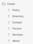
Policy
Directory
Contact
Forums
Services
About
Header
See more
Item 4
Item 3
Item 2
Item 1
Header
Item 1
Item 1
Item 1
Header
32
242
12k
This is a long line of text that will stretch across the page. Lorem ipsum dolor sit amet, consectetur adipiscing elit. Vivamus ut augue porta, bibendum sem non, accumsan dolor. Suspendisse vitae porttitor magna, vitae malesuada felis. Vivamus elit odio, sagittis at feugiat at, maximus ac nisl.
Item 3
Item 2
Item 1
About
Services
Forums
Contact
Directory
Policy
Header
See more
Item 4
Item 3
Item 2
Item 1
Header
Item 1
Item 1
Item 1
Header
Replace the left text field with the left column. Use the layers panel to move a copy into the group. Set flex-shrink to 0 in the styles
Replace the right text field with the right column. Use the layers panel to move a copy into the group. You may want to unstack the group and resize and the reestack the groups again. Select the main group and set the align to top.
Responsive Parts VI - Header
Let’s add a header and optionally make it stick to the top of the page. Move the items into position and then make them a group
Set the group to anchor left and right, change group to a Stack, set the layout to Stack and align items to center. Then set the site name item alignment to push content right
Add 12px of padding to the group. You can unstack, size and then stack again since padding expands out from it’s previous size
We can visually style the group background and border by adding a rectangle to the group and setting it as background.
Add a rectangle to the group and then in the layers panel right click and select “Make background”. Then in Element Options set the option, “Use as background”.
Let’s make add the left and right column we created earlier and create a group. Set the left and right anchor
Site Name
S
S
Side Menu
Side Menu
Site Name
S
S
Side Menu
Site Name
S
S
Side Menu
Site Name
S
S
32
242
12k
This is a long line of text that will stretch across the page. Lorem ipsum dolor sit amet, consectetur adipiscing elit. Vivamus ut augue porta, bibendum sem non, accumsan dolor. Suspendisse vitae porttitor magna, vitae malesuada felis. Vivamus elit odio, sagittis at feugiat at, maximus ac nisl.
Item 3
Item 2
Item 1
About
Services
Forums
Contact
Directory
Policy
Header
See more
Item 4
Item 3
Item 2
Item 1
Header
Item 1
Item 1
Item 1
Header
Side Menu
Site Name
S
S
Responsive Parts VII - Footer
Set the row to wrap.
Set the first item height to 21px to give space between rows. Gap is font height / 2 (14/2 = 7px)
Select the language item and add the flex to .8. This will make the item take up 80% of extra space pushing the items apart
To create a style rule, select the group and run the “Add style rule for all group items”. Edit the stylesheet template and add margin-right: 12px
Resize each text field to slightly wider than their current size to add margin between each item OR add a style rule (next line)
Set the group padding to 8 on each side. On the top padding set to 28px and at the bottom padding set 20 px
This is a long line of text that will stretch across the page. Lorem ipsum dolor sit amet, consectetur adipiscing elit. Vivamus ut augue porta, bibendum sem non, accumsan dolor. Suspendisse vitae porttitor magna, vitae malesuada felis. Vivamus elit odio, sagittis at feugiat at, maximus ac nisl.
Item 3
Item 2
Item 1
32
242
12k
This is a long line of text that will stretch across the page. Lorem ipsum dolor sit amet, consectetur adipiscing elit. Vivamus ut augue porta, bibendum sem non, accumsan dolor. Suspendisse vitae porttitor magna, vitae malesuada felis. Vivamus elit odio, sagittis at feugiat at, maximus ac nisl.
This is a long line of text that will stretch across the page. Lorem ipsum dolor sit amet, consectetur adipiscing elit. Vivamus ut augue porta, bibendum sem non, accumsan dolor. Suspendisse vitae porttitor magna, vitae malesuada felis. Vivamus elit odio, sagittis at feugiat at, maximus ac nisl.
Item 3
Item 2
Item 1
32
242
12k
This is a long line of text that will stretch across the page. Lorem ipsum dolor sit amet, consectetur adipiscing elit. Vivamus ut augue porta, bibendum sem non, accumsan dolor. Suspendisse vitae porttitor magna, vitae malesuada felis. Vivamus elit odio, sagittis at feugiat at, maximus ac nisl.
Item 3
Item 2
Item 1
About
Services
Forums
Contact
Directory
Policy
Header
See more
Item 4
Item 3
Item 2
Item 1
Header
Item 1
Item 1
Item 1
Header
Side Menu
Project Milestone I
S
S
Responsive Parts VIII - Header II
Let’s make the header static. This means that the page content will flow underneath it (same as the header on this page)
Open the layers panel and drag the header out of the main group. Position it at the upper left most of the artboard.
Set the width to 100% and set the position to sticky. Note: We have the header in the group below to not disrupt this guide
You can also select the group and run the Make fixed header macro
To see the results view the Project Milestone II
Move the other content down the page so it starts after the header
Side Menu
Site Name
S
S
Side Menu
Site Name
S
S
Add a background fill to the rectangle in the group so that the content is not shown through it. Change the opacity if needed.
In some cases adding a drop shadow makes it stand out above the other content as a user scrolls. Add this to the rectangle
The rounded border doesn’t fit in this design. Select the rectangle and remove the border.
Make sure the rectangle is not turned into Path. If it is undo it or add a rectangle again
This is a long line of text that will stretch across the page. Lorem ipsum dolor sit amet, consectetur adipiscing elit. Vivamus ut augue porta, bibendum sem non, accumsan dolor. Suspendisse vitae porttitor magna, vitae malesuada felis. Vivamus elit odio, sagittis at feugiat at, maximus ac nisl.
Item 3
Item 2
Item 1
32
242
12k
This is a long line of text that will stretch across the page. Lorem ipsum dolor sit amet, consectetur adipiscing elit. Vivamus ut augue porta, bibendum sem non, accumsan dolor. Suspendisse vitae porttitor magna, vitae malesuada felis. Vivamus elit odio, sagittis at feugiat at, maximus ac nisl.
Item 3
Item 2
Item 1
About
Services
Forums
Contact
Directory
Policy
Header
See more
Item 4
Item 3
Item 2
Item 1
Header
Item 1
Item 1
Item 1
Header
Responsive Parts IX - Hide Left Column
Let’s hide some parts of the page when the layout is thinner than a certain size. We do this to show a different view for mobile, tablet and desktop browsers. Let’s hide the left column when the browser is less than 500 pixels wide.
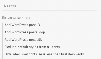
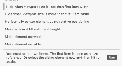
First we need to define a sizing element with a Macro. The sizing element tells the macro what size to perform the action
Add a text field below and set its width to 500 pixels.
Now select the sizing element (the text field) and then the left column and open the Macros panel.
Note: You can move the sizing element into the same group temporarily if it helps select multiple items Or you can move the element out of the group temporarily. Or you can select the group, run the macro and then select the sizing element in the second step
This is a long line of text that will stretch across the page. Lorem ipsum dolor sit amet, consectetur adipiscing elit. Vivamus ut augue porta, bibendum sem non, accumsan dolor. Suspendisse vitae porttitor magna, vitae malesuada felis. Vivamus elit odio, sagittis at feugiat at, maximus ac nisl.
Item 3
Item 2
Item 1
32
242
12k
This is a long line of text that will stretch across the page. Lorem ipsum dolor sit amet, consectetur adipiscing elit. Vivamus ut augue porta, bibendum sem non, accumsan dolor. Suspendisse vitae porttitor magna, vitae malesuada felis. Vivamus elit odio, sagittis at feugiat at, maximus ac nisl.
Item 3
Item 2
Item 1
32
242
12k
This is a long line of text that will stretch across the page. Lorem ipsum dolor sit amet, consectetur adipiscing elit. Vivamus ut augue porta, bibendum sem non, accumsan dolor. Suspendisse vitae porttitor magna, vitae malesuada felis. Vivamus elit odio, sagittis at feugiat at, maximus ac nisl.
This is a long line of text that will stretch across the page. Lorem ipsum dolor sit amet, consectetur adipiscing elit. Vivamus ut augue porta, bibendum sem non, accumsan dolor. Suspendisse vitae porttitor magna, vitae malesuada felis. Vivamus elit odio, sagittis at feugiat at, maximus ac nisl.
Item 3
Item 2
Item 1
32
242
12k
This is a long line of text that will stretch across the page. Lorem ipsum dolor sit amet, consectetur adipiscing elit. Vivamus ut augue porta, bibendum sem non, accumsan dolor. Suspendisse vitae porttitor magna, vitae malesuada felis. Vivamus elit odio, sagittis at feugiat at, maximus ac nisl.
Item 3
Item 2
Item 1
About
Services
Forums
Contact
Directory
Policy
Header
See more
Item 4
Item 3
Item 2
Item 1
Header
Item 1
Item 1
Item 1
Header
Responsive Parts X - Header III
Let’s create a menu that will be hidden on smaller screens and show a hover menu
Define a sizing element to define when to hide or show an element. The sizing element is used with a macro
Create a group with multiple text elements in it, set the group row and spacing to space between. Set text items to no sizing
Add it to the header group
Make a second icon for the hover menu
Create some menu items and add a hyperlink value. Set the sizing to width
Add your menu underneath it and align it to how you want it to appear
Add a rectangle to the group and in the layers panel select Make Background. In the panel check Use as Background
Add an additional style rule to add padding and remove text styles that are incompatible with the menu interface we are creating
Group the menu button and the menu
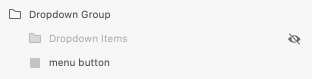
Select the dropdown items and go into the layers panel and hide the menu or Shift + Click on the Displayed option
Select the dropdown group and then run one of two macros Show Descendants on Hover OR Show Descendant on Hover macro. Use ALT to choose between
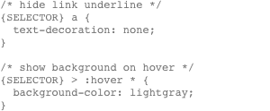
The Show Descendants on Hover produces the code on the main group below.
OR use The Show Descendant on Hover (single descendant).
Select the dropdown group and set the cursor to pointer
Add a few lines over the menu button rectangle. Select the rectangle and set the opacity to 0 and group
Add the group to the header and run Show item when less than width
Group the items To optionally add row highlights set the group to Stack. Open the menu items group CSS template Add a style rule to select each item in the group to remove the hyperlink underline and show a background on hover
That adds one of the following code to the dropdown group CSS template depending on the layout type
That adds one of the following code to the dropdown group CSS template depending on the layout type
The descendant gains a class
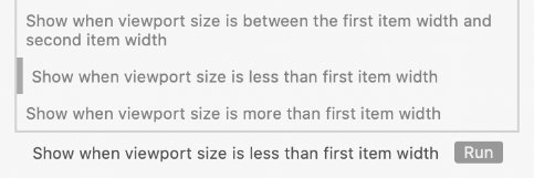
Now select the menu item group and then open the Macros panel. Select Hide when viewport size is less than width. Click run
Because you only have one item selected it will instruct you to select another element to use as the sizing element. Select the tex field and click run again
Note: You can move the sizing element into the same group temporarily if it helps select multiple items Or you can move the element out of the group temporarily. Or you can select the group, run the macro and then select the sizing element in the second step
Define a sizing element to define when to hide or show an element. The sizing element is used with a macro
This text field is this many pixels wide
Because you only have one item selected it will instruct you to select another element to use as the sizing element. Select the tex field and click run again
Note: You can move the sizing element into the same group temporarily if it helps select multiple items Or you can move the element out of the group temporarily. Or you can select the group, run the macro and then select the sizing element in the second step
Note: Follow the instructions to use the Show Descendant Macro: 1. Select the main group and click run 2. Select the descendant and click run 3. Select the main group again and click run
This is a long line of text that will stretch across the page. Lorem ipsum dolor sit amet, consectetur adipiscing elit. Vivamus ut augue porta, bibendum sem non, accumsan dolor. Suspendisse vitae porttitor magna, vitae malesuada felis. Vivamus elit odio, sagittis at feugiat at, maximus ac nisl.
Item 3
Item 2
Item 1
32
242
12k
This is a long line of text that will stretch across the page. Lorem ipsum dolor sit amet, consectetur adipiscing elit. Vivamus ut augue porta, bibendum sem non, accumsan dolor. Suspendisse vitae porttitor magna, vitae malesuada felis. Vivamus elit odio, sagittis at feugiat at, maximus ac nisl.
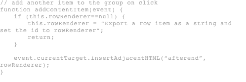
Let’s add code to the show more button that adds another row of content when the button is pressed. Since this guide is exported to the same page ids and class names can be renamed or duplicated. The code in examples following this will be simplified to avoid errors.
Note: This is more complicated than previous sections. Skip this section if you don’t need this
In the button add an attribute onclick=“addRowItem(event)” and set the cursor to pointer
Select last item and click the Export as string option. Set the id to rowRenderer (case sensitive)
32
242
12k
This is a long line of text that will stretch across the page. Lorem ipsum dolor sit amet, consectetur adipiscing elit. Vivamus ut augue porta, bibendum sem non, accumsan dolor. Suspendisse vitae porttitor magna, vitae malesuada felis. Vivamus elit odio, sagittis at feugiat at, maximus ac nisl.
Item 3
Item 2
Item 1
About
Services
Forums
Contact
Directory
Policy
Header
See more
Item 4
Item 3
Item 2
Item 1
Header
Item 1
Item 1
Item 1
Header
See more
Item 3
Item 2
Item 1
Add the same thing to the main content group
Add a Show more button and set the script template below (replace smart quotes)
Since the code above can break when we copy and paste it multiple times in the same artboards or in a single page application we will use code that dynamically uses the first item to in a list and repeats it.
Note: Typically if you need to write code you will do it outside of this software. It will help you find and identify errors.
For examples, small amounts of code, code in controlled environments or code that runs in an environment that can report errors it’s OK by this author.
Note: The code above references JavaScript variables that reference CSS styles that is not applied on other artboards. This means if you simply copy the items to another artboard in a single page application it may reference something that has no styles applied to it. Check the console in the browser for errors
In the button attribute add onclick=“addContentRow(event)”
In the left list button attribute add onclick=“{SELECTOR_NAME}AddItem(event)”
In the right list button attribute add onclick=“{SELECTOR_NAME}AddItem(event)”
This is a long line of text that will stretch across the page. Lorem ipsum dolor sit amet, consectetur adipiscing elit. Vivamus ut augue porta, bibendum sem non, accumsan dolor. Suspendisse vitae porttitor magna, vitae malesuada felis. Vivamus elit odio, sagittis at feugiat at, maximus ac nisl.
Item 3
Item 2
Item 1
32
242
12k
This is a long line of text that will stretch across the page. Lorem ipsum dolor sit amet, consectetur adipiscing elit. Vivamus ut augue porta, bibendum sem non, accumsan dolor. Suspendisse vitae porttitor magna, vitae malesuada felis. Vivamus elit odio, sagittis at feugiat at, maximus ac nisl.


